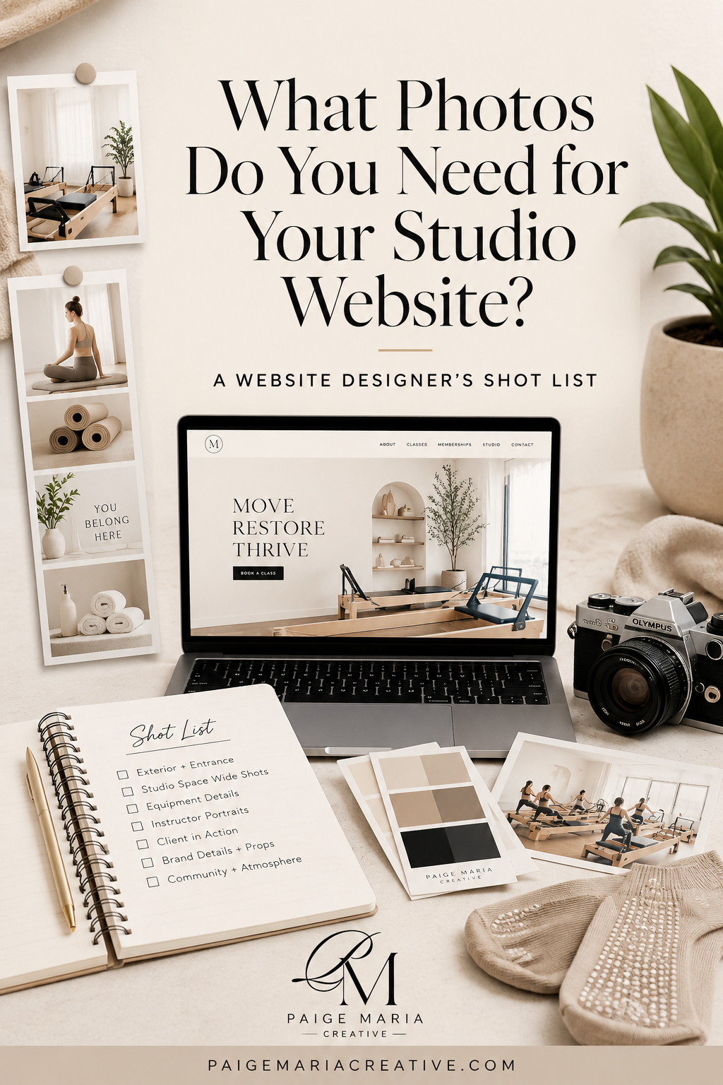
What Photos Do You Need for a Pilates Studio Website?
A Website Designer’s Shot List for Boutique Fitness Studios
One of the biggest misconceptions I see from studio owners is thinking they need more photos for their website.
Most of the time, they actually just need the right photos.
Because website imagery isn’t just there to make your brand look pretty — it shapes how your website feels, functions, and converts.
The right imagery helps potential clients quickly understand:
what your studio feels like
who your classes are for
what kind of experience they can expect
and whether they can picture themselves walking through your doors
As a website designer for boutique fitness and wellness brands, I’m not just looking for beautiful photos. I’m looking for images that support layout, storytelling, mobile design, and user experience.
Because unfortunately, a photo can look incredible on Instagram and still work terribly on a website.
That’s why having a strategic shot list before your brand shoot can make such a big difference — especially if you’re investing in professional photography or planning a studio content day.
Below are the website imagery categories I recommend almost every Pilates, Lagree, yoga, or boutique fitness studio capture for their website.
1. Wide Studio Shots
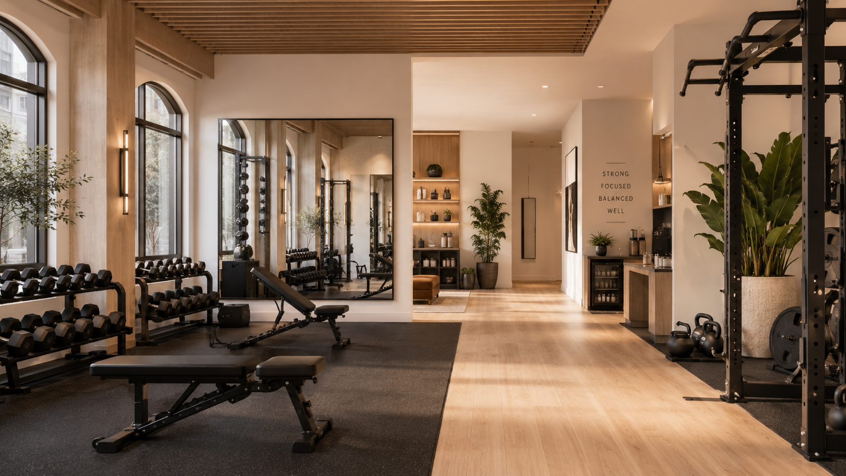
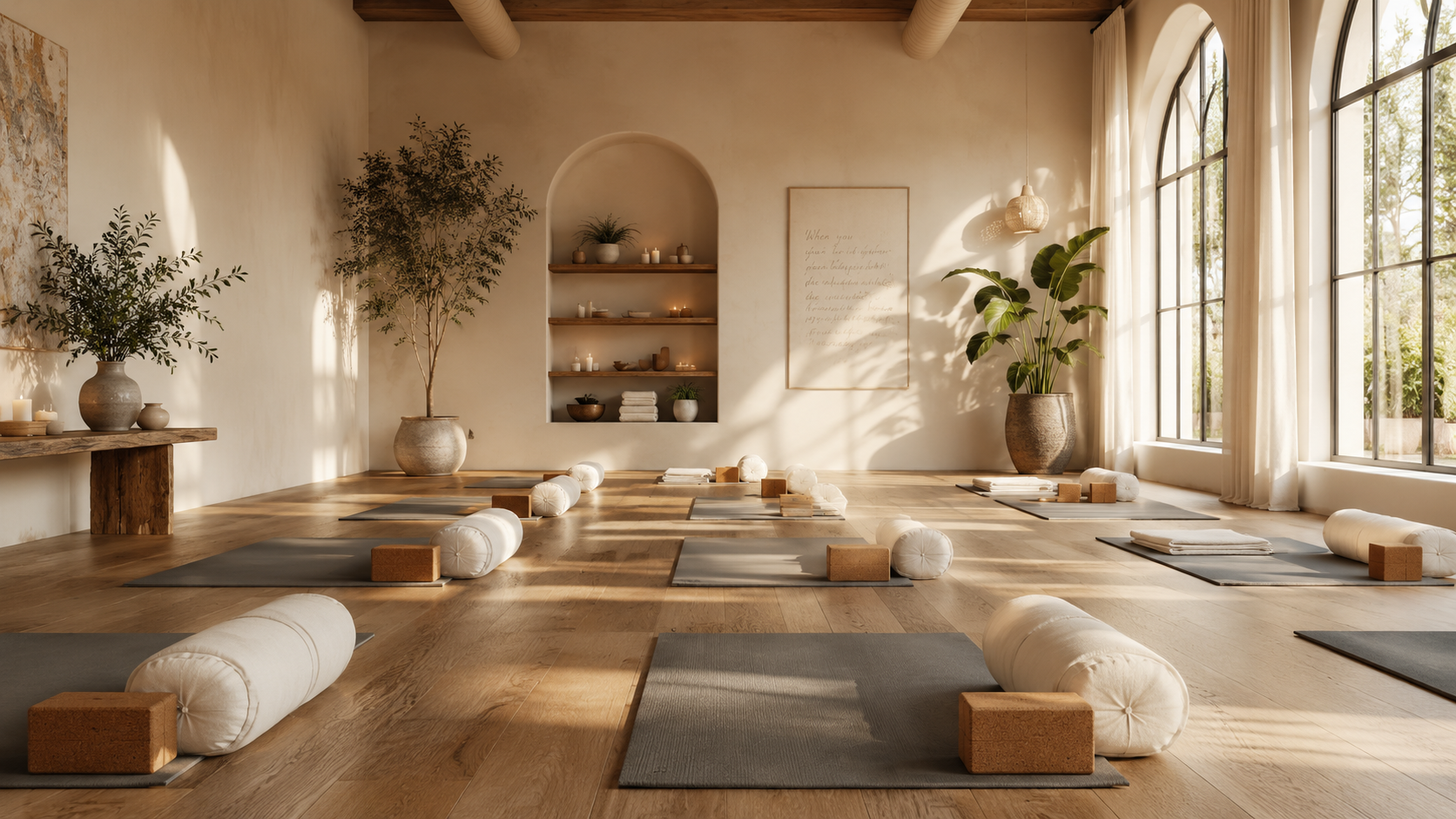
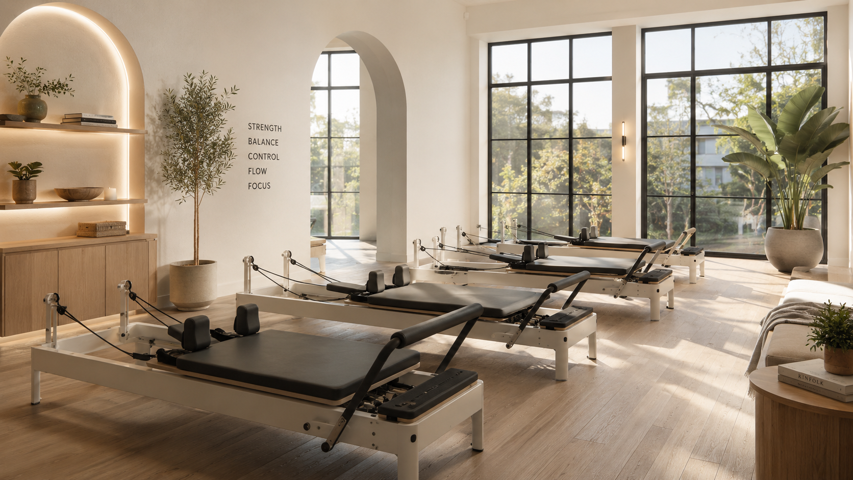
Wide studio shots are the images that help people immediately understand your space.
These are usually brighter, wider-angle photos that showcase the layout of the studio, the equipment, the lighting, and the overall atmosphere. They create orientation right away and often become the foundation of a strong homepage design.
Where to Use Them
Homepage hero sections
About pages
Contact page banners
Full-width website sections
Why These Matter
When someone lands on your website, one of the first things they’re subconsciously asking is:
“Can I picture myself here?”
Wide studio imagery helps answer that question immediately.
These photos help visitors quickly understand how your studio feels before they ever read a single word. They communicate whether the environment feels calming or energetic, minimal or luxurious, intimate or community-driven.
And in boutique fitness, that matters.
Because people are rarely just choosing a workout. They’re choosing an environment they want to return to multiple times a week.
This is especially important for newer clients who may already feel intimidated walking into a Pilates or Lagree studio for the first time. Wide shots help reduce uncertainty. They give people clarity about the physical experience of the space and help them mentally place themselves inside it.
From a website strategy perspective, these images also create trust. A polished, well-lit studio instantly feels more established and professional online.
What Studios Often Get Wrong
A lot of studios end up photographing only the “pretty corner.”
The neon sign.
The aesthetic smoothie moment.
The perfectly styled retail shelf.
And while those details absolutely support your branding, they don’t fully communicate the actual experience of being inside the studio.
Potential clients are still subconsciously trying to figure out whether the space feels welcoming, intimidating, beginner-friendly, or physically comfortable. They want to mentally understand the environment before they commit to booking.
Wide shots answer those questions without needing to say a word.
Detail shots create atmosphere.
Wide shots create understanding.
The strongest studio websites need both.
Quick Tips
Prioritize natural light whenever possible, leave room for text and buttons when framing your shots, and make sure you capture both horizontal and vertical versions for website flexibility.
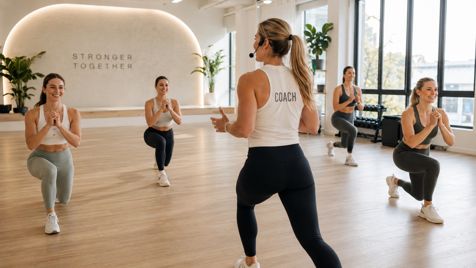
2. Instructor Interaction Shots
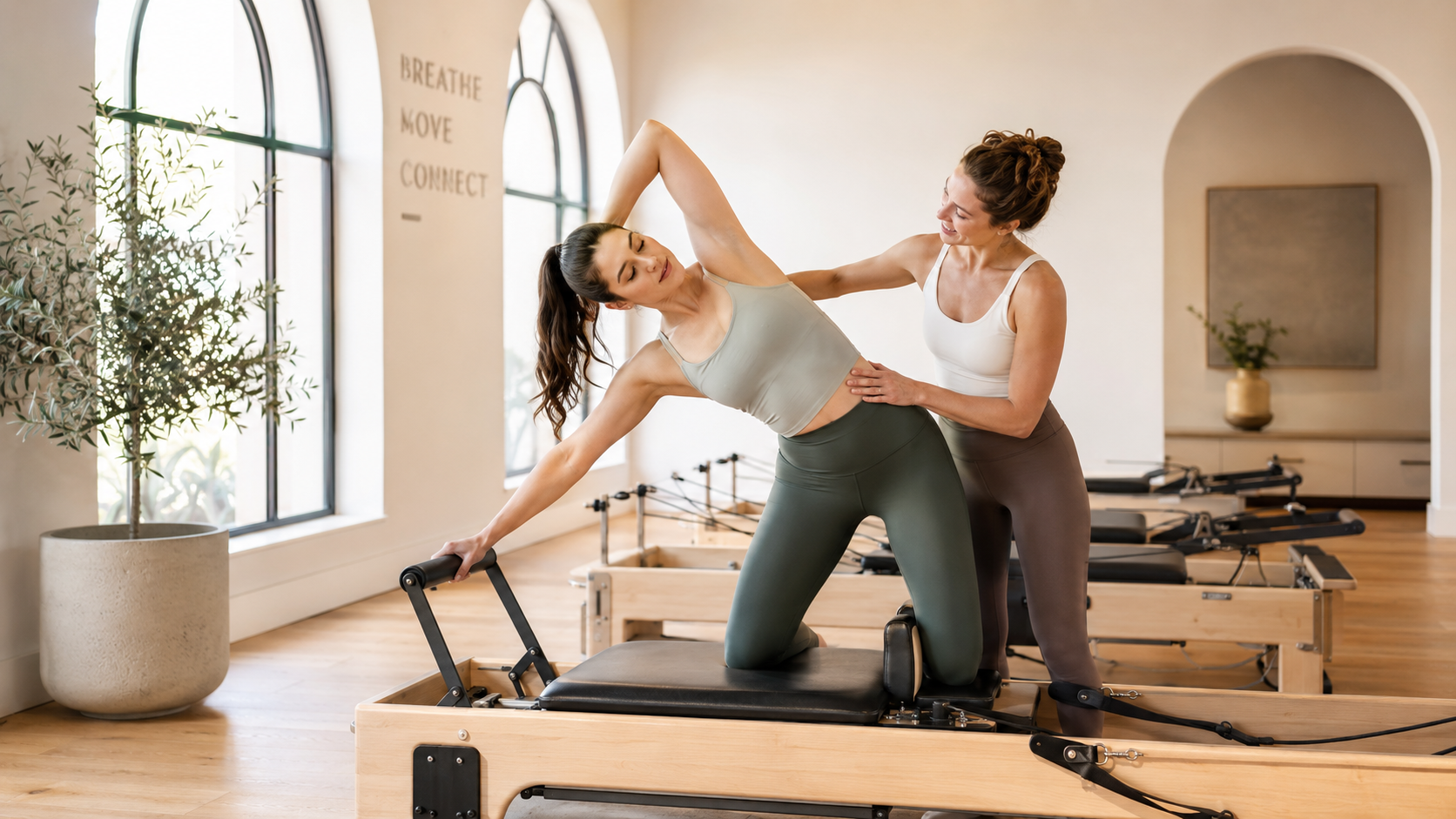
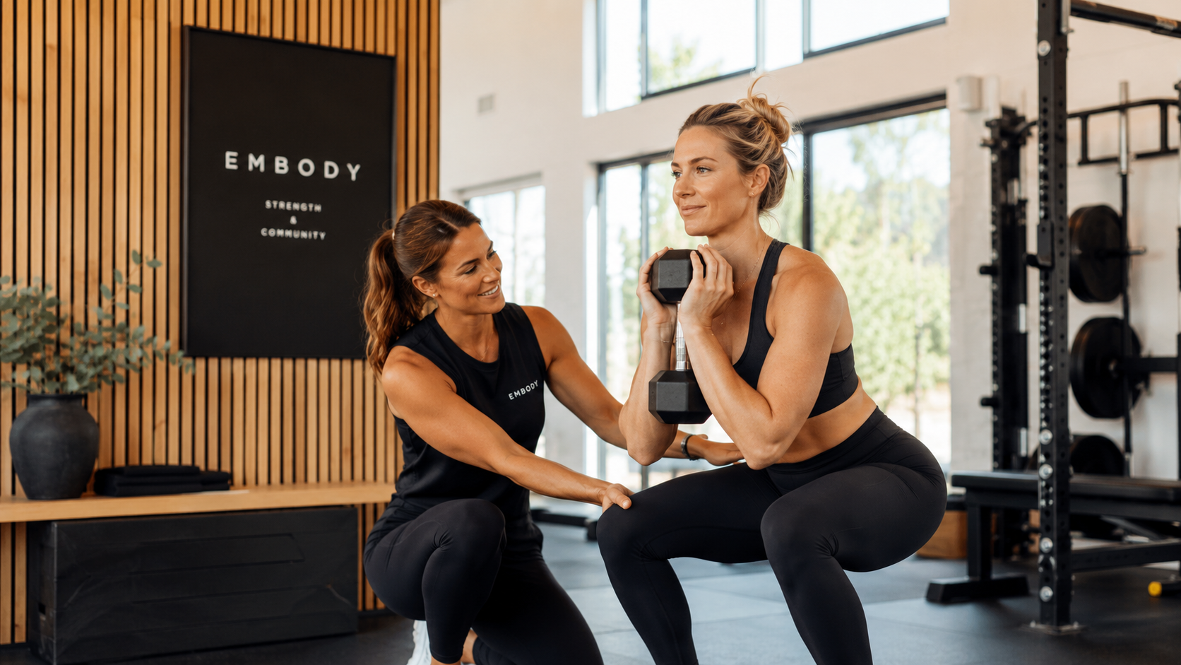
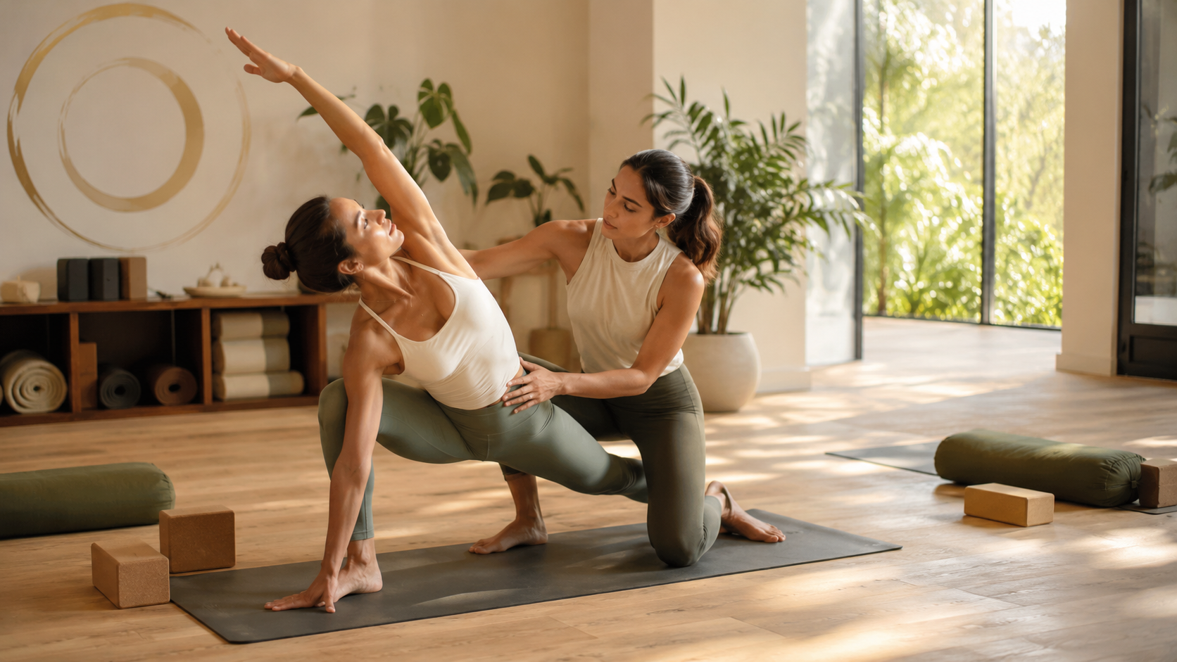
Instructor interaction shots capture actual teaching moments inside your studio.
These aren’t just posed branding portraits or smiling group photos. The strongest interaction shots usually show instructors cueing movement, correcting form, encouraging clients, or creating genuine connection during class.
This is where branding photography and website strategy really start overlapping.
Where to Use Them
About pages
Instructor/team pages
Homepage service sections
New client pages
Private training pages
Why These Matter
One thing I think boutique fitness brands sometimes forget is this:
People are not just choosing a workout.
They’re choosing a teacher.
Especially in Pilates, Lagree, yoga, and other instructor-led modalities, the quality of instruction is a huge part of what keeps clients coming back.
Potential clients want to feel supported, welcomed, and confident they’re in good hands. Instructor interaction imagery communicates that much more effectively than perfectly posed headshots ever could.
These photos also help soften uncertainty for newer clients. Someone visiting your website for the first time may already feel nervous about not knowing the equipment, being inexperienced, or walking into a space that feels overly exclusive.
Images of real interaction make the experience feel more approachable and human.
And honestly, those moments usually build more trust than highly polished branding imagery ever will.
What Studios Often Get Wrong
A lot of studios focus heavily on aesthetic imagery and forget to visually communicate the quality of their instruction.
But long-term retention usually comes from the experience people have inside the class — not just how beautiful the studio looks online.
Your website imagery should reflect that.
The strongest studio brands don’t just look elevated.
They feel trustworthy.
Quick Tips
Prioritize candid moments over overly posed ones, photograph instructors actively teaching, and focus on warmth, connection, and natural expressions instead of perfection.
3. Movement & Action Shots
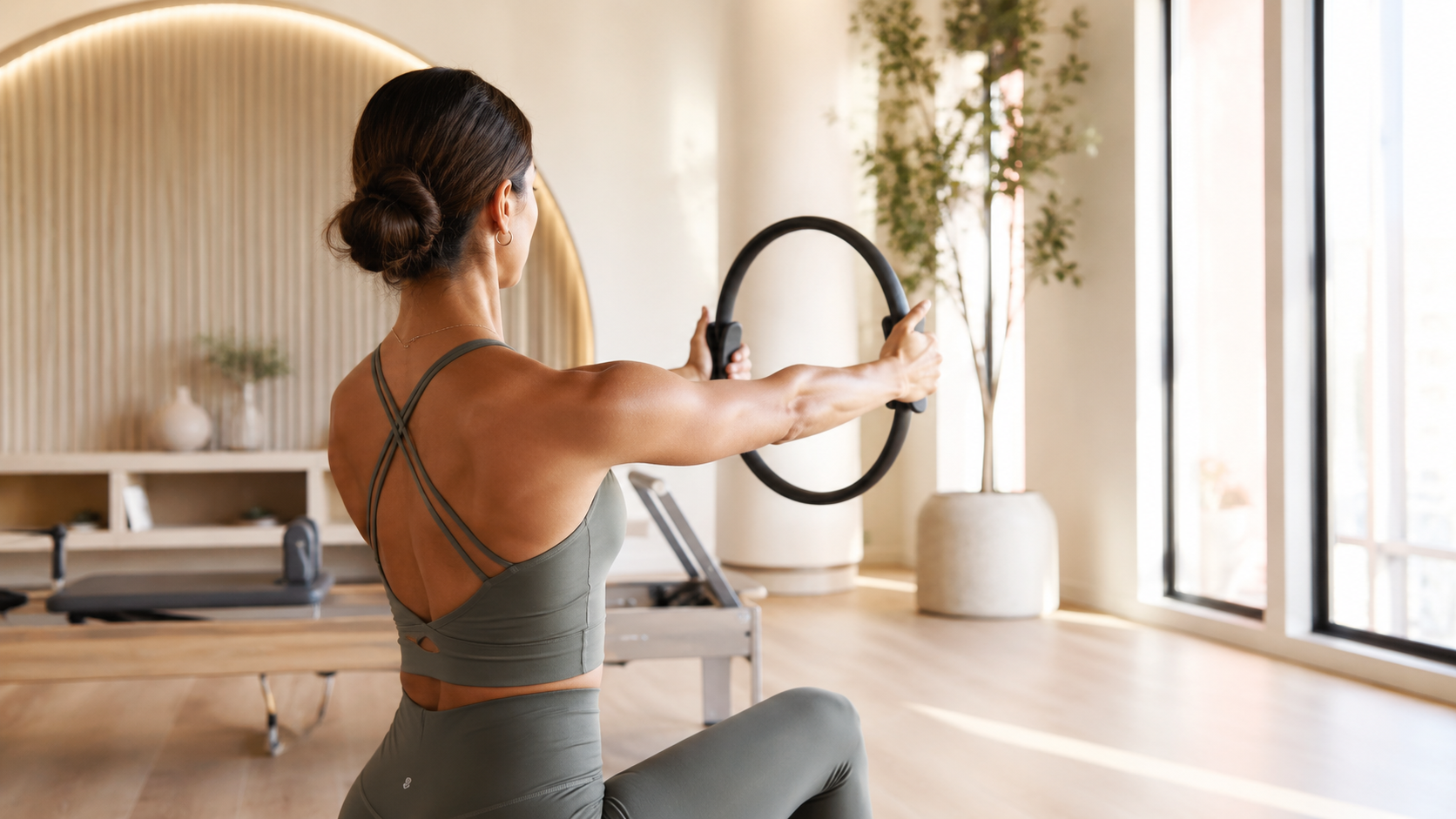
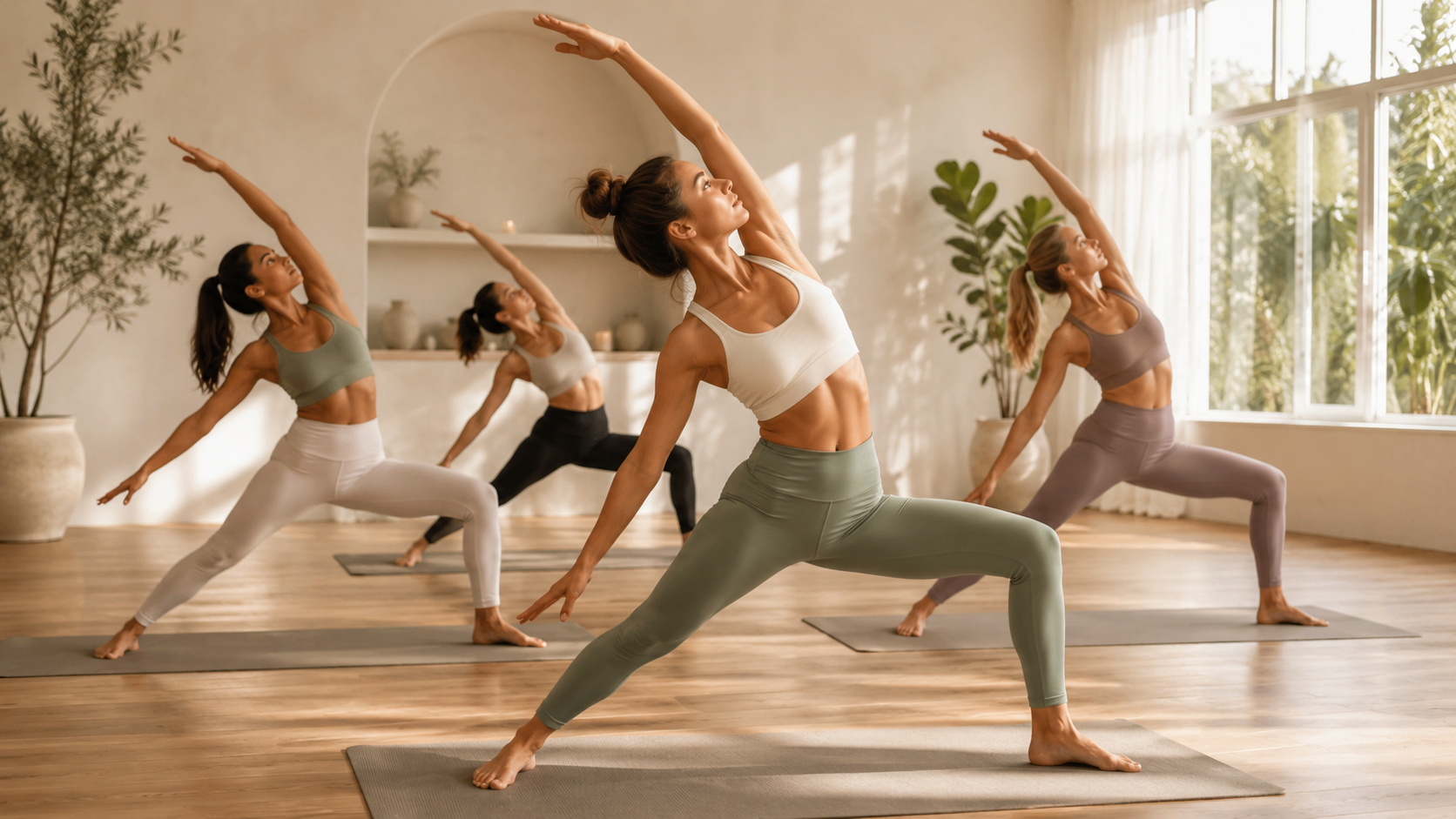
Movement and action shots are the images that show your classes actually happening.
These photos capture movement in progress — posture, transitions, control, rhythm, strength, focus, and the physical energy of class itself.
For Pilates and Lagree studios especially, movement imagery communicates the style and emotional tone of your classes far more effectively than text alone ever could.
Where to Use Them
Class description pages
Homepage service sections
Membership pages
Landing pages
Social proof sections
Why These Matter
Potential clients are constantly trying to figure out:
“What does a class here actually feel like?”
Movement imagery helps answer that immediately.
These photos communicate whether your classes feel intense or restorative, high-energy or intentional, technical or approachable. They help visitors understand the emotional tone of the experience before they ever step into the studio.
To someone unfamiliar with Pilates or Lagree, reformer photos can start blending together very quickly. Movement imagery is what differentiates your studio. It showcases your pacing, your teaching style, and the overall feeling of class itself.
From a website design perspective, these images also create momentum throughout the layout.
A website filled entirely with static posed branding photos can start feeling emotionally flat very quickly. Movement photography creates rhythm, flow, and visual energy throughout the page — especially on longer homepage layouts.
What Studios Often Get Wrong
Not every movement photo needs to show the hardest or most intense moment of class.
Sometimes the strongest website imagery comes from quieter, more intentional moments — controlled form, transitions between exercises, a deep breath before movement, or an instructor cueing alignment.
Those moments often communicate professionalism, intentionality, and emotional connection much more effectively than chaotic “go hard” fitness imagery.
Especially in boutique fitness, people are usually looking for more than intensity.
They’re looking for an experience that feels elevated, supportive, and transformative.
Quick Tips
Prioritize controlled movement over chaotic motion, capture strong posture and body lines, and leave negative space for layouts and text overlays whenever possible.
4. Detail Shots
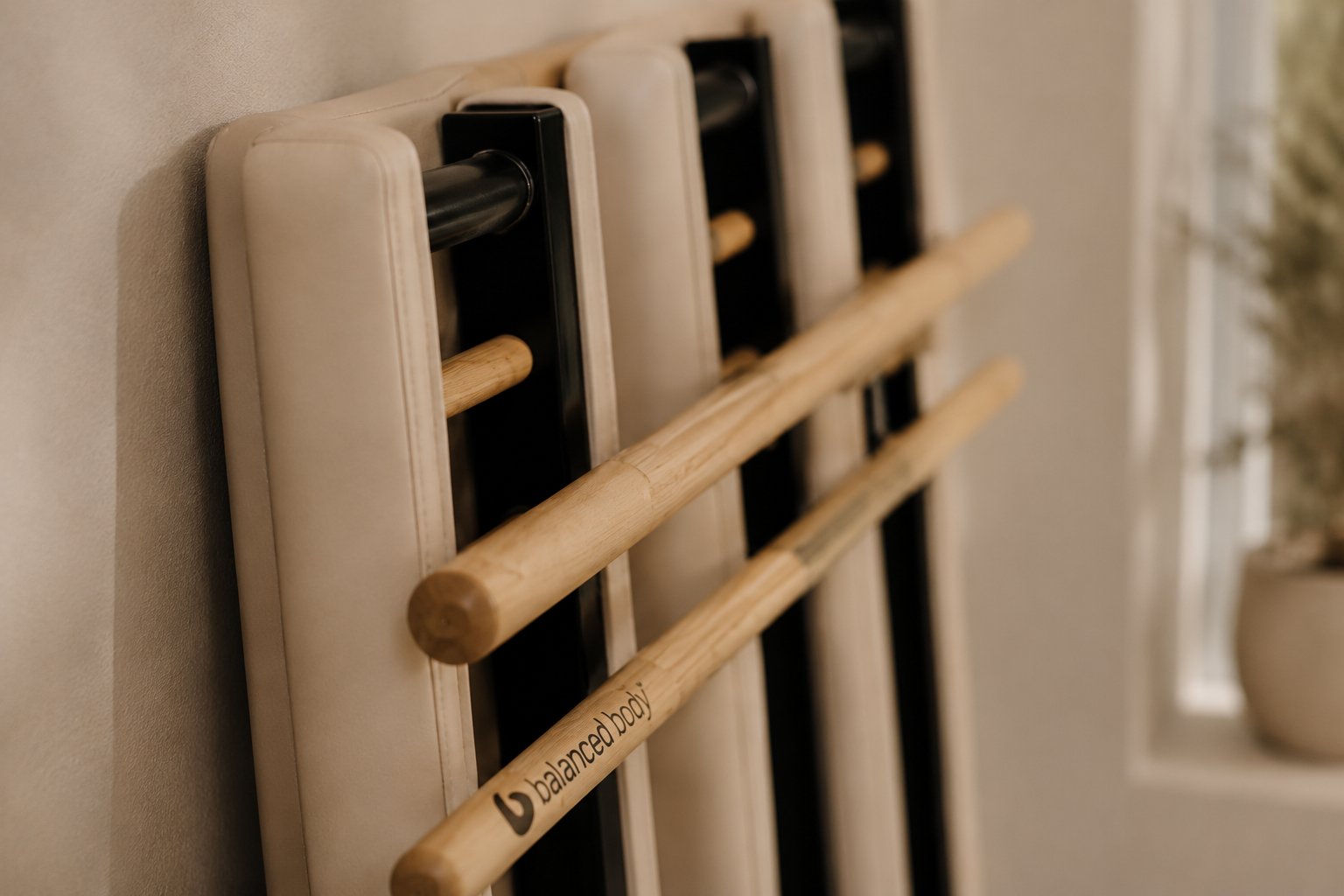
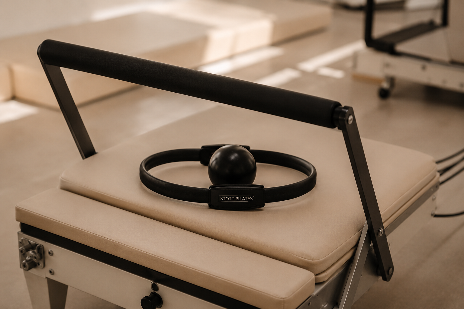
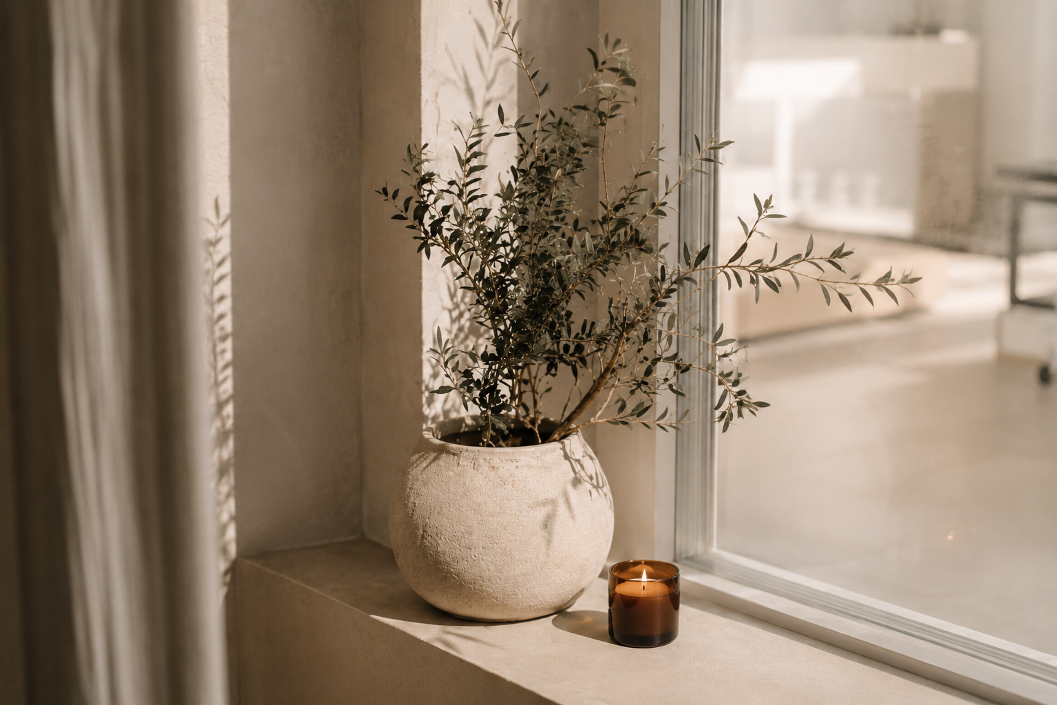
Detail shots are the close-up images that make a website feel layered, intentional, and elevated.
These are often the smallest moments — hands adjusting springs, grip socks on the reformer, folded towels, mirrors catching natural light, equipment textures, jewelry during movement — but they play a huge role in shaping how your brand feels online.
Not every image on your website needs to explain something.
Some images exist to create emotional tone.
Where to Use Them
Transitional website sections
Pricing pages
Background imagery
Blog graphics
Mobile layouts
Brand storytelling sections
Why These Matter
Detail shots are often what make a website feel finished.
Without them, websites can start feeling visually repetitive very quickly — especially in boutique fitness where many wide class images naturally look similar.
These photos create breathing room throughout a layout. They help sections transition more naturally and give the website a more editorial, intentional feeling overall.
But they also do something deeper than that.
Detail imagery subtly communicates care, professionalism, cleanliness, luxury, and atmosphere. It reinforces the idea that your studio pays attention to the small things.
And in boutique fitness, that matters.
Because clients are often paying for more than just the workout itself. They’re paying for atmosphere, ritual, emotional escape, comfort, and overall experience.
Detail imagery visually reinforces all of that.
What Studios Often Get Wrong
A lot of studios think detail shots are “extra.”
But honestly, these are often the images that create the emotional tone of a website.
Wide shots help people understand the space.
Movement shots help people understand the workout.
Detail shots help people feel the brand.
And when used strategically throughout a website, they’re often what make a studio brand feel elevated instead of generic.
Quick Tips
Focus on texture, lighting, and composition. Capture tactile, immersive moments, keep framing intentional and uncluttered, and always shoot both horizontal and vertical versions when possible.
5. Lifestyle & Experience Shots
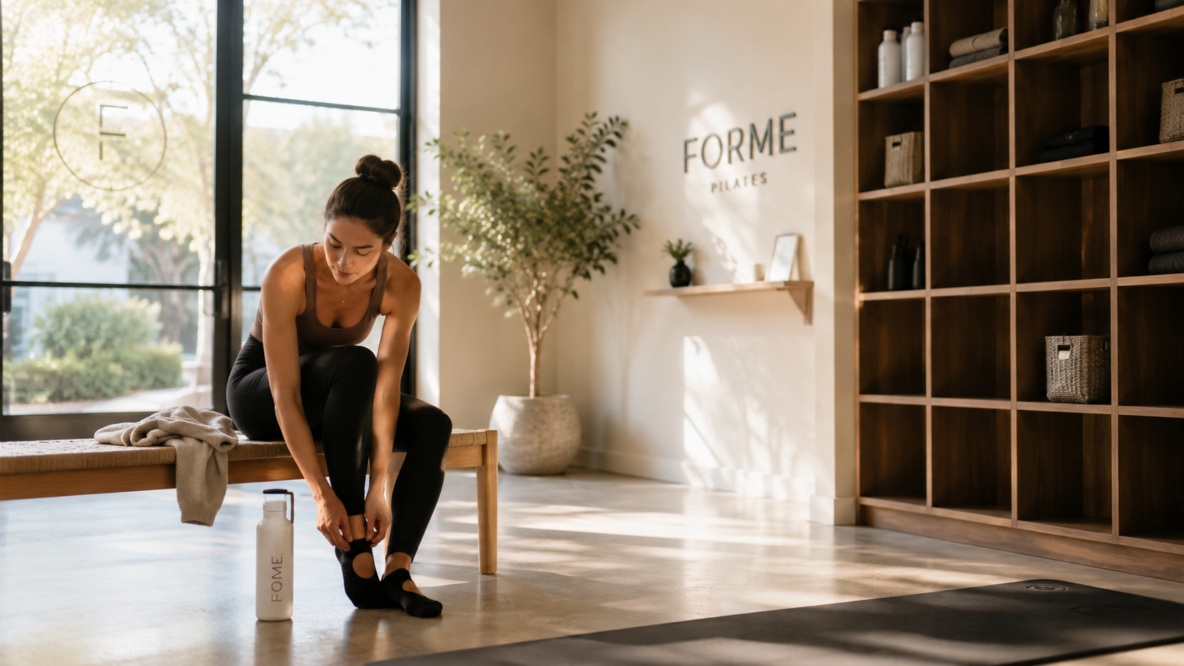
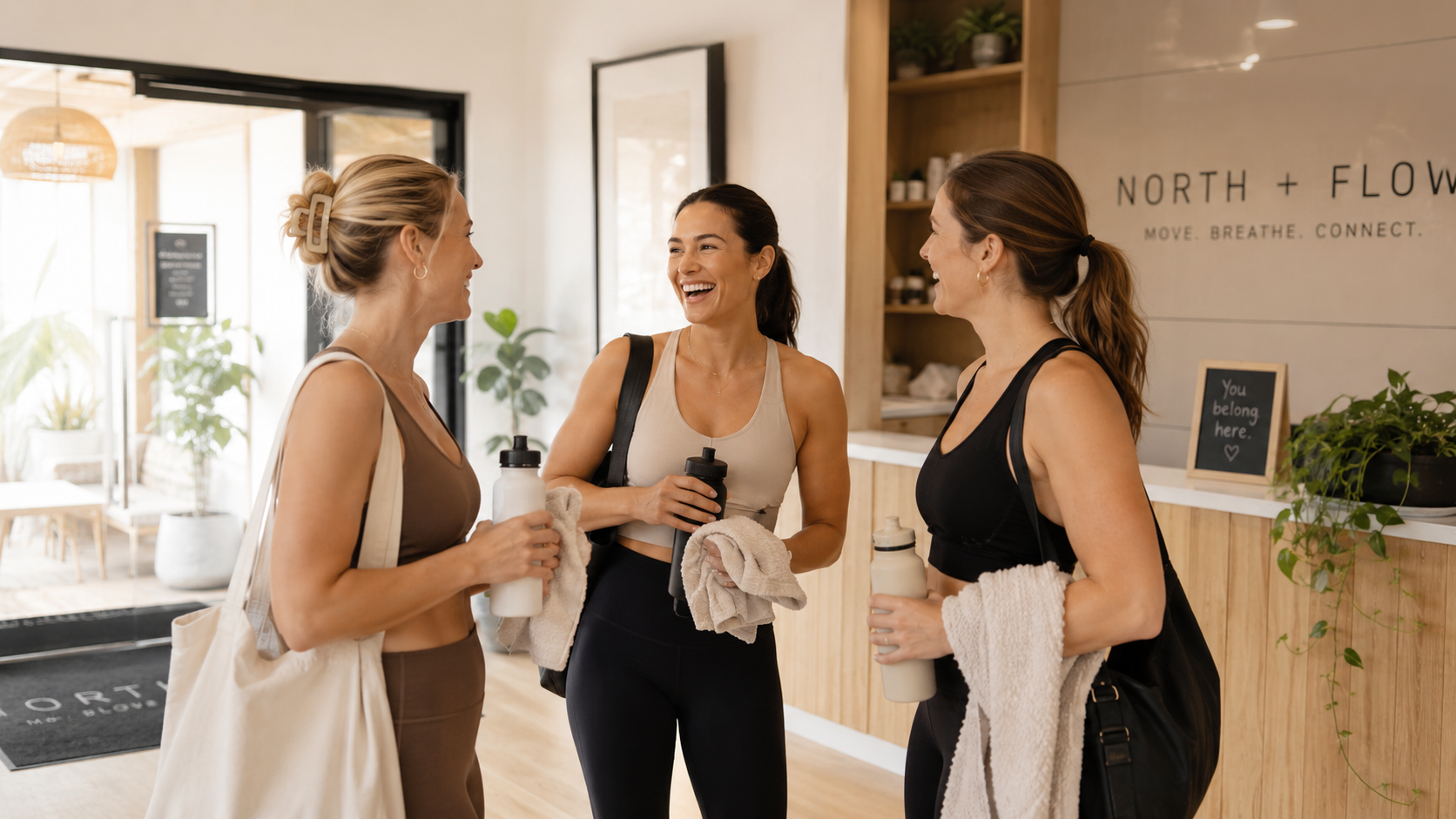
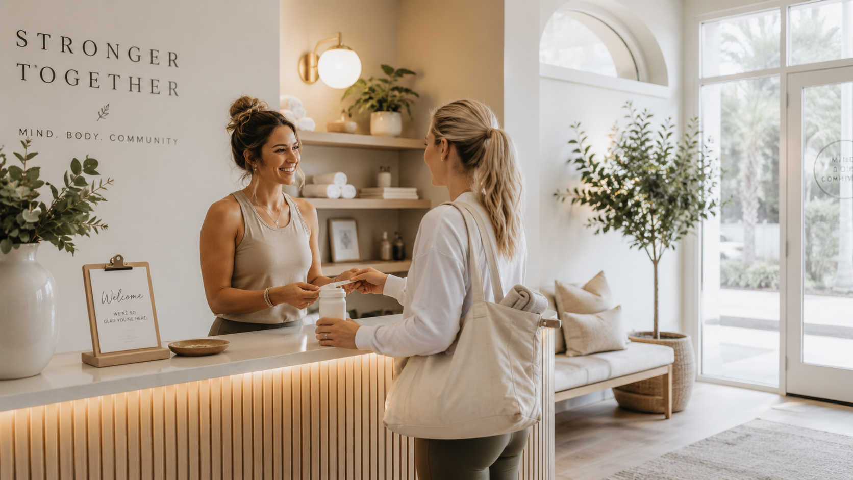
Lifestyle and experience shots are the images that help people emotionally connect to your studio beyond the workout itself.
These are the moments surrounding class — walking into the studio, chatting after class, getting settled before a session, checking in at the front desk, grabbing a water bottle, sitting in the lobby, or simply existing comfortably inside the space.
And honestly? These are often some of the most underrated images for a studio website.
Where to Use Them
Homepage sections
New client pages
Membership pages
Community-focused sections
About pages
Email opt-in sections
Why These Matter
One thing I always remind studio owners is this:
People don’t just book classes.
They book experiences.
Lifestyle imagery helps visitors imagine what it would actually feel like to become part of your studio community.
That emotional connection matters more than a lot of brands realize.
Because when someone is considering joining a new studio, they’re usually asking themselves questions like:
Will I feel comfortable there?
Will I fit in?
Does this environment feel welcoming?
Is this somewhere I could actually see myself coming every week?
Lifestyle imagery helps answer those questions subtly and emotionally.
And from a website strategy perspective, these photos help soften the overall experience of the site. If every image is movement-heavy or instructional, the brand can start feeling overly clinical or transactional.
Lifestyle moments create warmth.
They make the studio feel lived-in, human, and emotionally approachable.
This is especially important for boutique fitness brands, where community and emotional experience are often a huge part of retention.
What Studios Often Get Wrong
A lot of studios only photograph the workout itself.
But some of the strongest brand moments actually happen around the class:
conversations after sessions
nervous first-timer moments
instructors welcoming clients in
people settling into the space
laughter between classes
small rituals and routines
Those moments are what make a studio feel real.
And often, they’re the moments potential clients emotionally connect to the most.
Your website shouldn’t just show the workout.
It should show the experience of being there.
Quick Tips
Capture moments before and after class, prioritize genuine interaction over perfectly posed imagery, and look for moments that feel natural, relaxed, and emotionally warm. These images work best when they feel observational rather than overly staged.
6. Hero Video
A hero video is the short, atmospheric video that sits at the top of your homepage and immediately sets the tone for your brand.
When done well, it gives visitors a feeling before they start scrolling. It creates movement, warmth, energy, and immersion in a way a still photo sometimes can’t.
But a good hero video is not the same thing as a reel.
For a website, the goal isn’t to show every angle of your studio, every service you offer, or the most intense moment of class. The goal is to create atmosphere.
Where to Use It
Homepage hero section
Coming soon page
Launch page
Sales page
Brand storytelling section
Why This Matters
Your homepage hero section is often the first impression someone has of your studio online.
And because of that, your hero video needs to do a very specific job.
It should help people feel the tone of your brand quickly — whether that’s calm, elevated, energetic, community-driven, luxurious, restorative, or strong.
A strong hero video can make a website feel more polished and immersive, but only when it supports the layout instead of competing with it.
From a website designer’s perspective, this is where a lot of hero videos go wrong. The footage may be beautiful, but if it’s too busy, too fast, too dark, or too tightly cropped, it becomes hard to place text and buttons over it.
And suddenly the video is working against the website instead of helping it.
A good hero video should leave room for the website to breathe.
What Studios Often Get Wrong
A lot of studios approach hero video like social media content.
Fast cuts. Dramatic transitions. Lots of movement. High-energy clips. Multiple angles in just a few seconds.
That might work for Instagram, but on a website it can feel chaotic.
Website visitors are not trying to consume content at reel speed. They’re trying to understand where they are, what you offer, and whether your studio feels like the right fit for them.
That means your hero video should feel slower, cleaner, and more intentional.
Think:
Slow movement.
Natural light.
Hands adjusting springs.
A client walking into the studio.
A reformer carriage gliding.
An instructor gently cueing.
A calm breath before movement.
A detail shot of equipment, towels, plants, or the check-in area.
These small moments often make a much stronger website video than an overly edited montage.
Your hero video should create atmosphere, not distraction.
Quick Tips
Keep the footage slow, steady, and intentional. Prioritize natural light, simple compositions, and clips that still feel beautiful without sound. Leave negative space for headlines and buttons, avoid overly busy scenes, and make sure the video can loop smoothly without feeling jarring.
Final Thoughts
Your website imagery does more than make your site look beautiful.
It helps people understand your space, feel your brand, trust your team, and picture themselves becoming part of your studio before they ever book a class.
The right photos can make your website feel polished, intentional, welcoming, and easy to connect with. The wrong photos — or not enough variety — can make even the most beautiful website feel flat, repetitive, or disconnected from the experience you’ve created in real life.
That’s why I always recommend thinking about your website photos strategically before your next brand shoot or content day.
You don’t just need pretty photos.
You need photos that support your layout, tell your story, guide your visitors, and help your website actually do its job.
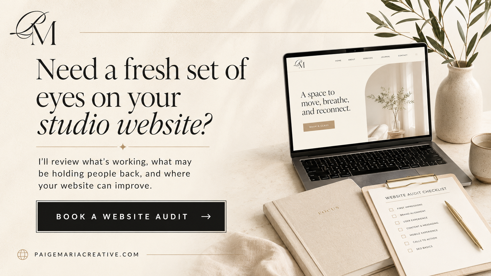
Want to Know What Your Website Needs?
If you’re not sure whether your current website imagery, layout, or user experience is helping people book — a website audit is a great place to start.
I’ll take a look at your website and help you identify what’s working, what may be holding people back, and what updates could make your site feel more aligned, polished, and conversion-friendly.
From imagery and layout to booking flow and overall brand experience, you’ll walk away with clear direction on how to improve your website.
Ready for a fresh set of eyes on your studio website?
Book a website audit and let’s find what your site needs next.