Website Updates to Make Before Your Next Promotion
A checklist for making your offer easier to find, understand, & book.
Promotions are one of the easiest ways to bring fresh energy into your studio.
Maybe you’re launching a new intro offer, opening enrollment for a challenge, promoting a workshop, releasing a seasonal class pack, or pushing gift cards around the holidays. Whatever the offer is, you probably spend a lot of time getting it ready. You think through the pricing, create the graphics, write the captions, send the email, talk about it at the front desk, and make sure your team knows what to say.
But there’s one place studio owners often forget to update:
the website.
And that matters because when someone sees your promotion on Instagram, in an email, or through a friend, your website is often the next place they go. If they land there and cannot quickly find the offer, understand the details, or figure out how to book, you may lose them before they ever make it to checkout.
Not because the promotion wasn’t good.
Not because they weren’t interested.
Not because they didn’t want to try your studio.
But because the path from interest to action was not clear enough.
Your website should support your promotion, not make people work harder to find it. Before you launch your next offer, challenge, workshop, intro special, or seasonal campaign, here are the website updates I’d make first.
1. Add the Promotion to Your Homepage
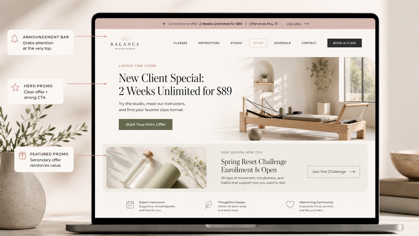
Your homepage is usually the first place people land, so your promotion should be easy to find there.
This does not mean your entire homepage needs to become one giant ad. But if you are actively promoting something, it should have a clear, visible place on the page.
A lot of studio owners will post about an offer on Instagram, mention it in stories, maybe send an email… but then the website looks exactly the same.
That creates a disconnect.
If your promotion matters, make sure your website reflects it.
Depending on the offer, you could add:
A small announcement bar at the top of the site.
A homepage section under the hero.
A feature block near your pricing section.
A pop-up or banner.
A button in your main navigation.
A limited-time callout in your hero section.
For example:
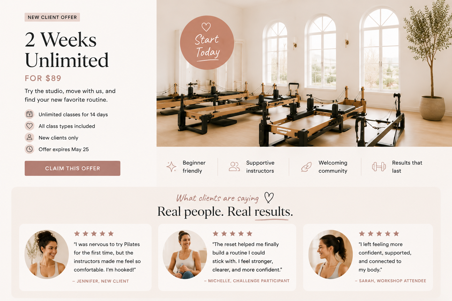
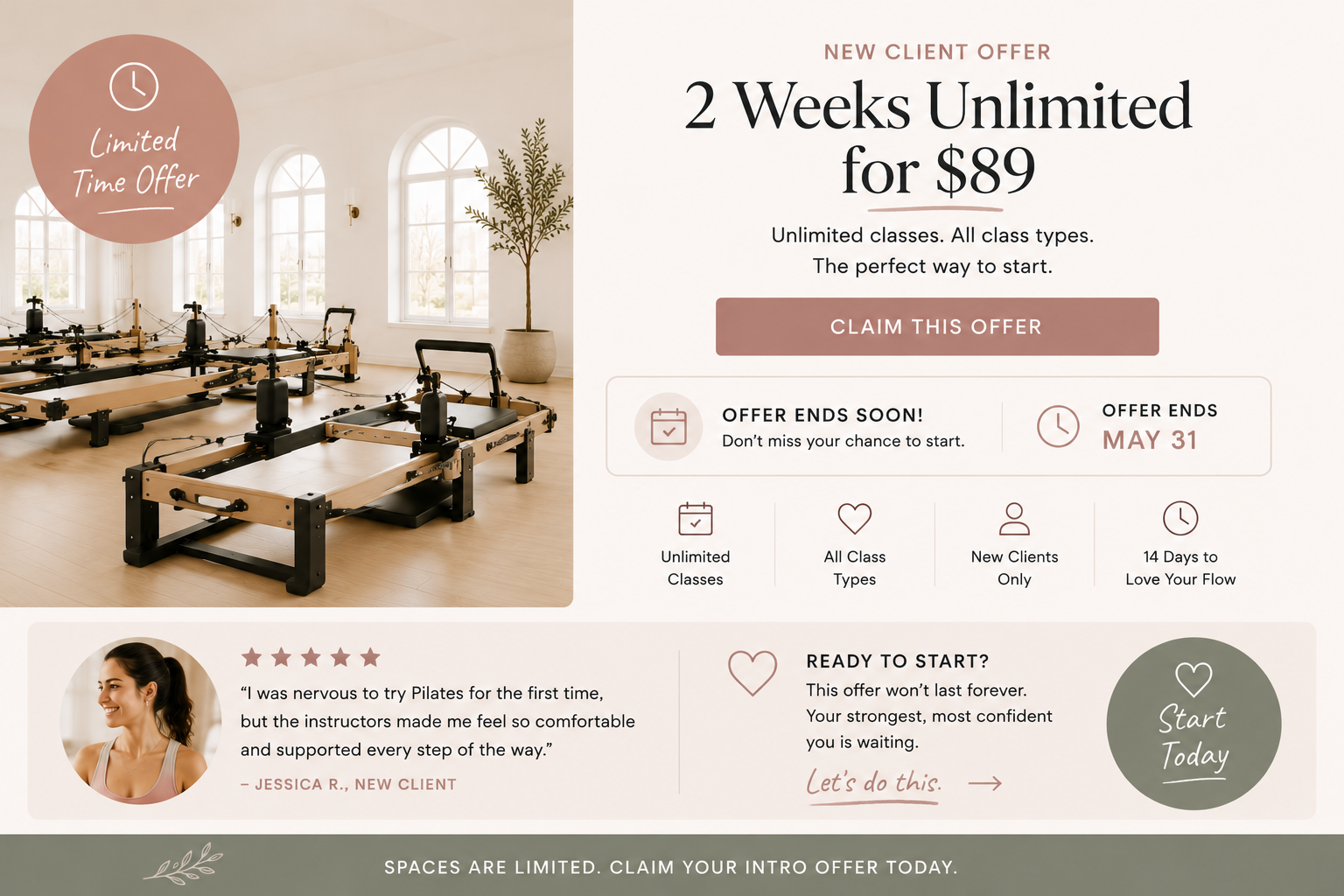
New Client Special: 2 Weeks Unlimited for $89
Try the studio, meet our instructors, and find your favorite class format.
Button: Start Your Intro Offer
Or:
Spring Reset Challenge Enrollment Is Open
Four weeks of classes, accountability, and support to help you build consistency.
Button: Join the Challenge
The goal is simple: If someone lands on your website during the promotion, they should know the offer exists without having to hunt for it.
2. Create One Clear Landing Page
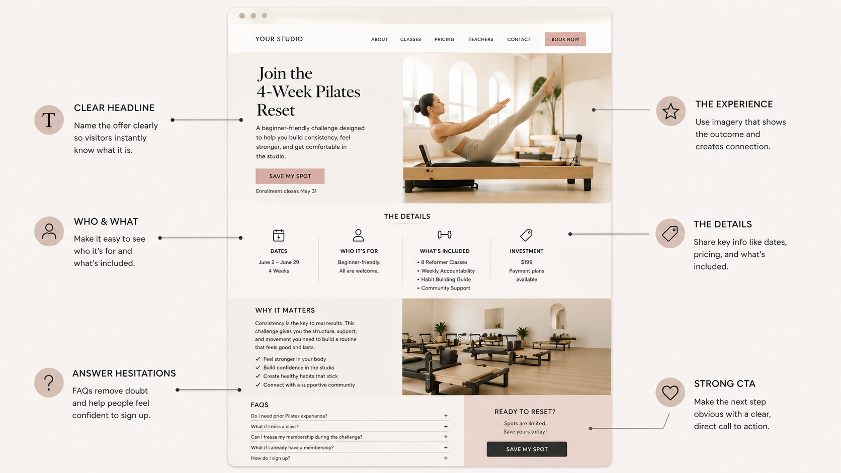
Not every promotion needs a complicated funnel, but most promotions need a focused page.
A landing page gives the offer one dedicated place to live. Instead of sending people to your homepage, pricing page, schedule, Instagram link-in-bio, or third-party booking system with no explanation, you can send them to a page that explains the offer clearly.
A good promotional landing page should answer:
What is the offer?
Who is it for?
What is included?
How much does it cost?
When does it start or end?
What should they expect?
How do they sign up?
This is especially helpful for:
Challenges.
Workshops.
Limited-time memberships.
Founding member offers.
Private events.
Seasonal class packs.
New student specials.
Teacher trainings.
Retreats.
Your landing page does not have to be long. It just needs to be focused.
A simple structure could look like this:
Headline: Name the offer clearly.
Subheadline: Explain the outcome or experience.
Details: What is included, price, dates, and who it is for.
Why it matters: Help people understand the value.
FAQs: Answer common hesitations.
CTA: Link directly to buy, book, apply, or inquire.
For example:
Join the 4-Week Pilates Reset
A beginner-friendly challenge designed to help you build consistency, feel stronger, and get comfortable in the studio.
Then include the dates, number of classes, price, what is included, and a clear button: Save My Spot
The benefit of a landing page is that people do not have to piece the offer together from five different places.
Everything they need is in one spot.
3. Make the CTA Button Specific
During a promotion, vague buttons are not your friend.
A button that says Learn More might be fine in some places, but when you want people to act, the button should tell them exactly what happens next.
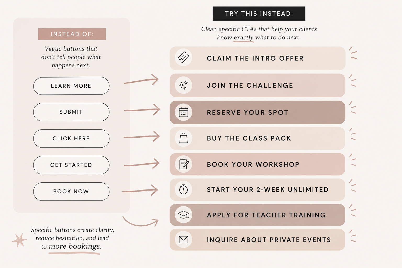
Specific buttons reduce uncertainty.
When someone sees Claim the Intro Offer, they know what they are clicking for. When they see Reserve Your Spot, they understand the next action. When they see Buy the Class Pack, there is no confusion about what comes next.
This matters because people are often making quick decisions online.
They are scanning.
They are comparing.
They are distracted.
They are on their phone.
Your CTA should make the next step obvious.
4. Link Directly to the Purchase or Booking Flow
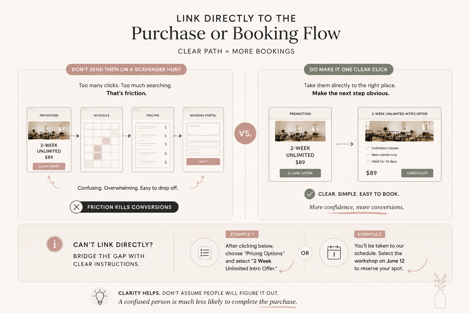
This is where a lot of promotions lose momentum.
Someone reads about the offer. They are interested. They click the button. Then they land on a general schedule page, a long pricing menu, a confusing booking portal, or a page where the offer is not easy to find.
That is friction. And friction kills conversions.
Whenever possible, your promotion button should link directly to the specific offer, product, class, event, or booking option.
If you are promoting an intro offer, link directly to that intro offer.
If you are promoting a workshop, link directly to the workshop registration.
If you are promoting a class pack, link directly to the purchase page.
If your booking software does not allow a direct link, then your website needs to bridge the gap. Add clear instructions before the button, like:
After clicking below, choose “Pricing Options” and select “2 Week Unlimited Intro Offer.”
Or:
You’ll be taken to our schedule. Select the workshop on June 12 to reserve your spot.
Is it ideal? Not always. But clarity helps. Do not assume people will figure it out. A confused person is much less likely to complete the purchase.
5. Update Your Navigation or Announcement Bar
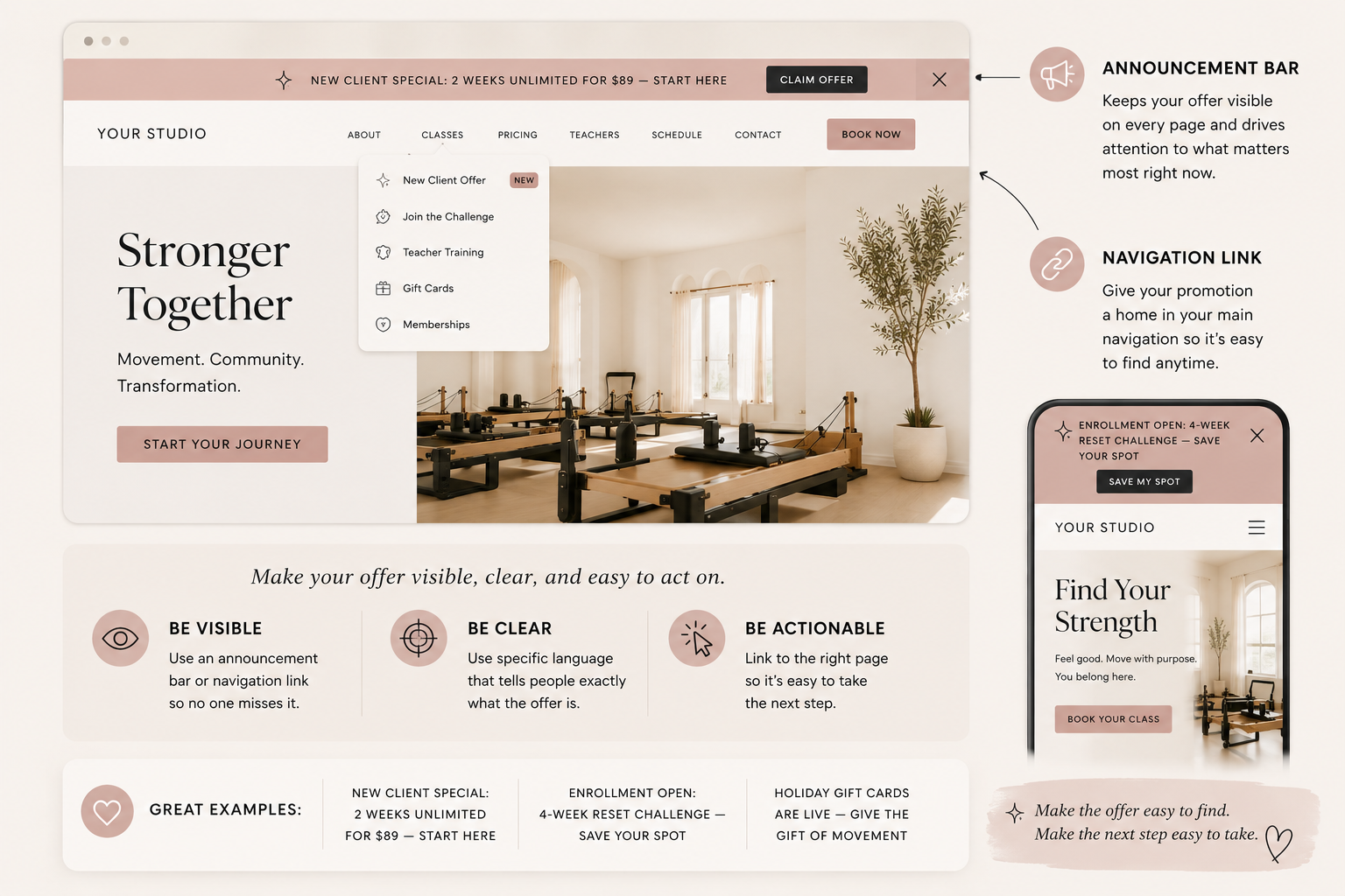
If the promotion is important, consider giving it a temporary spot in your navigation or announcement bar.
This works especially well for limited-time offers or events where urgency matters.
For example:
New Client Offer
Join the Challenge
Founding Memberships
Holiday Gift Cards
Summer Special
Teacher Training
You do not need to permanently restructure your whole site. But while the promotion is active, it should be easy to access from multiple places.
An announcement bar can be especially effective because it follows people across the site and keeps the offer visible.
Examples:
New Client Special: 2 Weeks Unlimited for $89 — Start Here
Enrollment Open: 4-Week Reset Challenge — Save Your Spot
Holiday Gift Cards Are Live — Give the Gift of Movement
The key is to keep it clear and direct.
Do not make the announcement bar too wordy.
Do not use vague language.
Do not link it to a random page.
Make the offer visible. Make the action obvious.
6. Add FAQs Before People Ask
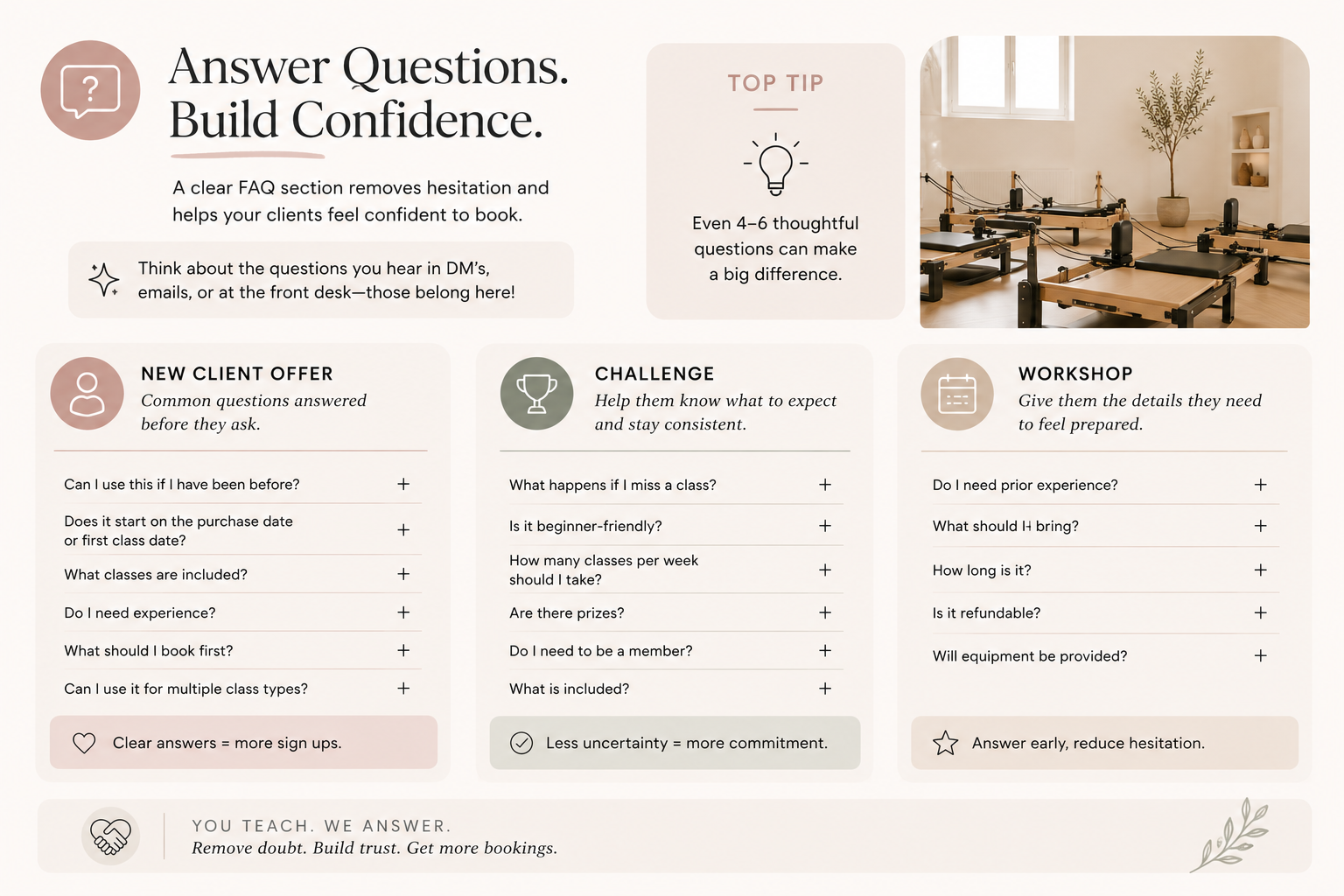
Promotions often create questions. And if your website does not answer those questions, people may hesitate.
For a new client offer, they may wonder:
Can I use this if I have been before?
Does it start on the purchase date or first class date?
What classes are included?
Do I need experience?
What should I book first?
Can I use it for multiple class types?
For a challenge, they may wonder:
What happens if I miss a class?
Is it beginner-friendly?
How many classes per week should I take?
Are there prizes?
Do I need to be a member?
What is included?
For a workshop, they may wonder:
Do I need prior experience?
What should I bring?
How long is it?
Is it refundable?
Will equipment be provided?
Your FAQs should remove hesitation before it becomes a reason not to sign up.
A strong FAQ section does not have to be huge. Even 4–6 questions can make the offer feel clearer and more approachable. Think about the questions people usually DM you, email you, or ask at the front desk. Those questions belong on the page.
7. Check the Mobile Experience
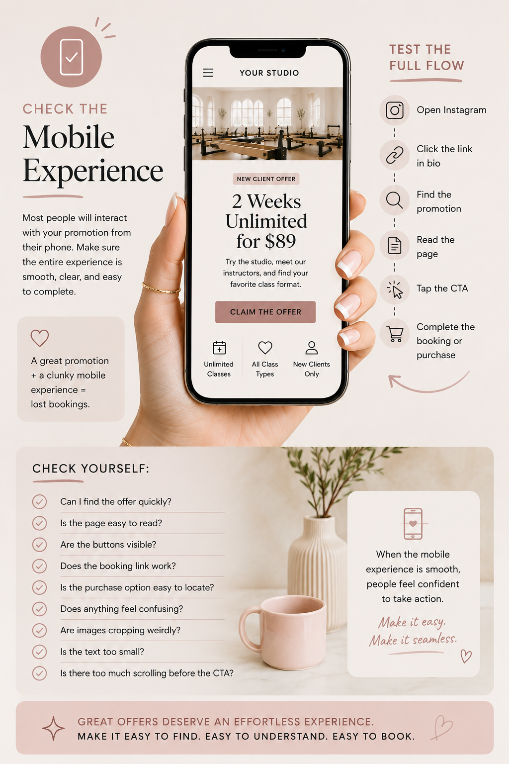
Before you announce your promotion, check the entire flow on your phone.
Not just the page.
The whole flow.
Open Instagram.
Click the link in your bio.
Find the promotion.
Read the page.
Tap the CTA.
Go through the booking or purchase process.
Ask yourself:
Can I find the offer quickly?
Is the page easy to read?
Are the buttons visible?
Does the booking link work?
Is the purchase option easy to locate?
Does anything feel confusing?
Are images cropping weirdly?
Is the text too small?
Is there too much scrolling before the CTA?
Most people will probably interact with your promotion from their phone, especially if they are coming from Instagram or email. So the mobile path matters.
A promotion can be great, but if the mobile experience feels clunky, people may abandon it.
8. Make Sure the Offer Matches Across Platforms
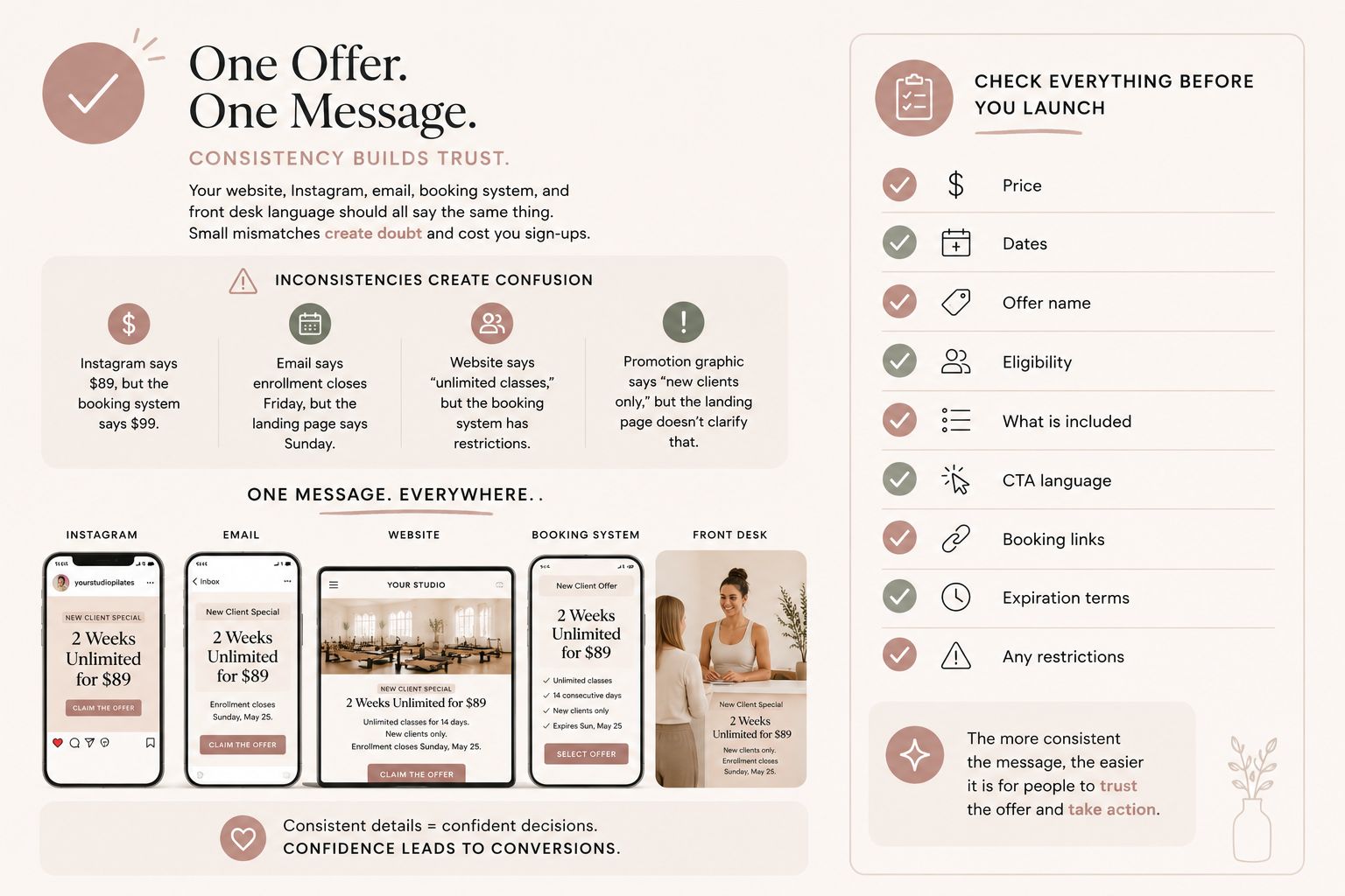
Your website, Instagram, email, booking system, and front desk language should all say the same thing. This sounds simple, but it is easy for details to get mismatched.
Maybe Instagram says the offer is $89, but the booking system says $99.
Maybe the email says enrollment closes Friday, but the landing page says Sunday.
Maybe the website says “unlimited classes,” but the booking system has restrictions that are not explained.
Maybe the promotion graphic says “new clients only,” but the landing page does not clarify that.
These inconsistencies create doubt.
Before launching, check:
Price.
Dates.
Offer name
Eligibility.
What is included.
CTA language.
Booking links.
Expiration terms.
Any restrictions.
Your promotion should feel cohesive everywhere someone sees it. The more consistent the message is, the easier it is for people to trust the offer and take action.
9. Add Social Proof Near the Offer
If you are asking someone to buy, book, or sign up, give them reassurance close to the decision point.
This could be a testimonial, a quick client quote, a transformation story, a review, or a simple line about what people love about the experience.
For example:
“I was nervous to try Pilates for the first time, but the instructors made me feel so comfortable.”
That kind of quote is powerful near a new client intro offer.
For a challenge, you might use:
“The reset helped me finally build a routine I could stick with.”
For a workshop:
“I left feeling more confident, supported, and connected to my body.”
Social proof helps people feel like they are not making the decision alone. It shows them someone else has gone first, had a good experience, and felt supported. This is especially important for new clients who may feel nervous about trying something unfamiliar.
10. Give the Promotion a Deadline or Clear Availability
If the promotion is time-sensitive, say so clearly. People need to understand when they need to act.
This does not mean you have to use fake urgency or dramatic countdown language. But if there is a real deadline, limited number of spots, or start date, make it visible.
Examples:
Enrollment closes May 31.
Only 12 spots available.
Offer available through Labor Day.
Challenge begins June 10.
Founding memberships available until opening week.
Early bird pricing ends Friday.
A clear deadline helps people make a decision. Without one, it is easy for someone to think, “I’ll come back later.” And later often becomes never.
Final Thoughts
Your promotion does not just need a good graphic.
It needs a clear path.
If you are putting energy into promoting an offer, your website should make that offer easy to understand, easy to trust, and easy to act on.
Before your next promotion goes live, check the basics:
Can people find it?
Can they understand it?
Can they book or buy easily?
Can they get their questions answered?
Can they do it all from their phone?
Because a promotion is not just about getting attention. It is about turning that attention into action. And your website plays a huge role in that.
A strong studio website does not just sit there looking pretty. It helps people move from interested to booked with less confusion and more confidence.
That is the goal.